

How to optimize your conversion funnel?
How to optimize your conversion funnel?
How to optimize your conversion funnel?
How to optimize your conversation funnel? This is a question that every businessman should ask himself. A real challenge for e-commerce websites, the optimization of your conversion funnel is a topic that should be studied. For this reason, in this article, we will provide you with 5 steps to optimize your conversation funnel.
- Test your site/ application/mockup
- Improve UX
- Fluidify the buying journey
- Optimize the space to order
- Perfectionate the delivery service
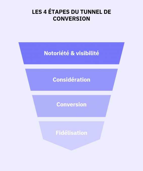
The different stages of the conversation funnel
To illustrate this article, we will use the example of Cdiscount, the French e-commerce giant that we tested thanks to our user panel. During our tests, we observed an end-to-end purchase-delivery experience, from Cdiscount home page, to the client’s reception of the package.
Test your site with user tests
Why test your site, application or mock up to optimize your conversation funnel? Well, performing user tests allows you to collect the users feedback about your project. Usability tests allow you to identify specifically the irritants or the strengths of your site, application or mock up.
Thanks to this feedback, it is possible to plan a roadmap and to implement improvements that are in line with the user’s expectations.
Let’s take the example of Cdiscount: During our test, a lot of users complained about an overloaded home page, particularly because of the presence of many offers. Thanks to the user’s feedback, Cdiscount identified precisely and easily the areas of improvement of its platform.
Improve the UX
This advice can seem rather vague, but we have listed some specific examples for you in this document: Top 10 UX mistakes. In general, it is not recommended to overload your web pages, to put invasive advertisements on your site, or still to not optimize the loading time of your site.
Simplify the web pages
As mentioned previously, an overloaded page is difficult to read. Having a simple page makes it easier to read for the user and to transfer information. It is also recommended to space your content, to ventilate your pages and to avoid mixing up several subjects on a reduced space. Otherwise, your users may not understand your content and leave your site.
Sites such as Nike or Coq Sportif are good examples, their pages are simple, readable, and easy to understand, making the user’s journey easier.
During our evaluation of the Cdiscount website, nearly 90% of the testers found that the home page was too loaded, specifically targeting offers. This overload made the site seem “aggressive” according to some users who would prefer a simpler site.
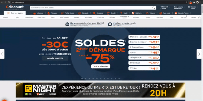
Cdiscount's Homepage
Reduce the load time
The time to load the site is another parameter that can cause users to leave your site and therefore to not convert. For example, according to a study by Selection, one out of 10 users leaves your website if they have to wait 2 seconds to load a page.
Therefore, the loading time influences the conversation rate which makes it’s optimization essential. To support this point, Contentsquare says that increasing the loading time by 0.1 seconds can decrease the conversation rate by 7%.
Thus, in order to measure the loading time and to improve your conversion funnel, we recommend you to tesr your website on Google Page Speed insight. This is very useful, this Google tool allows you to see what you can improve in order to reduce your loading time.
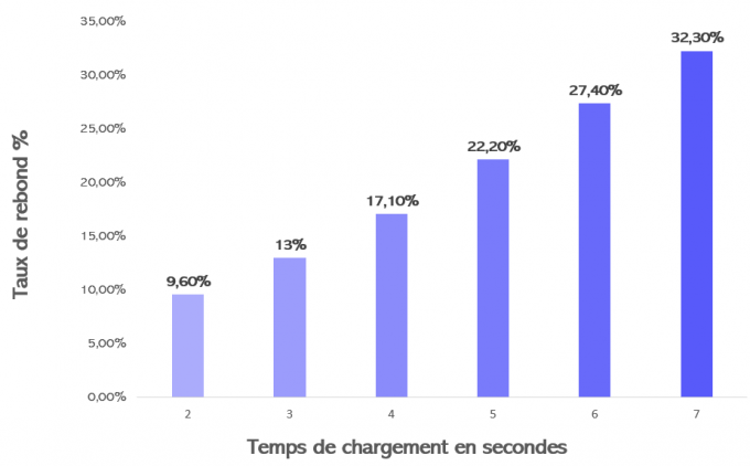
Bounce rate according to loading time
Improve your product pages
In order to optimize your conversation funnel, it is necessary to improve your product page. In order to do this, it is necessary to provide users with certain essential elements.
- A clear description of the product to describe the product you are selling. It is also possible to use pictograms in order to make the messages easier to understand.
- Customer reviews. This is a way to reassure the users about the quality of the product and or to help them in their choice.
- Product illustration. Just like the product’s description, images are essential for an efficient shopping experience. Nowadays, It is even strongly recommended to offer several images or even a video to present your product.
- CTAs or buttons that are easy to understand by users to place an order effortlessly.
- The information about the delivery in order to notify the users about the terms of his order. Just as in the description of the product, it may be useful to use pictograms.
During our Cdiscount evaluation, most of these elements were present and were appreciated by our testers. However, several users complained about the appearance of pop-ups when zooming in the pictures. This was another irritant discovered through user tests.
Advertisement, beware of the user’s experience
Another point that may cause debate, is the presence of advertisement on an ecommerce site. In fact, advertising can be a significant source of income for some retailers that generate a lot of traffic. However, it is also a source of irritation for a lot of internet users. During our study, 40% of testers said they were annoyed by ads, making their journey less enjoyable.
Our advice: Try reducing the presence of advertisements on your site and analyze the impact on the conversation rate, the average cart and other KPIs. It’s up to you then, to find the right balance when integrating advertisements to maximize your revenues without degrading the UX.
Fluidify the buying journey
Make the search easier
The search bar is another tool that allows you to fluidify the user's journey. User’s appreciate particularly when the latter offers an automatic suggestion solution. Once again, this helps save time, reduce the irritant points and therefore optimizes the conversion funnel.
Propose useful filters
Filters can be great additions to the search bar. They allow you to refine the search and to remove items that are irrelevant to the users. But for the filters to be useful, they have to be easy to use and most importantly, relevant. Thus, “price” and “free delivery” filters can prove very practical for users.

Cdiscount search filters
Optimize result pages
For a buying journey without problems, it is essential to linger on the results pages. Just like the rest of the site, the latter have to be clear. They have to allow the user to find the results of the research easily, but above all they have to be relevant. Thus, to optimize your conversation funnel, be sure to register all the products in your search engine with the right keywords.
Optimize your ordering space
Reassure users once in the cart
This is an important step in the purchase funnel, the shopping cart is very often abandoned by users. In order to solve this problem, it is necessary to reassure them and above all to follow some rules.
- Do not hesitate to recapitulate the order (product, price, quantity etc) before proceeding to the payment. This reassures users about what they are about to order.
- Provide several safe payment methods (Credit card, PayPal, Gift card etc) to make your customers' lives easier.
- Provide an assistance phone number or chat available for the customer. A FAQ is not enough.
Optimize the creation of an account!
Very often mandatory, the creation of the account should not necessarily be compulsory. In fact, the creation of the account can be one of the biggest reasons that can push users to abandon a shopping cart.
It is a long step where personal information is communicated. In order to optimize your conversation funnel, it is recommended to not force your users to create an account.
However, if you still decide to force your users to do so, for safety or business reasons, make their task easy. Only ask for essential information to create the account. Is it really necessary to ask for the user’s date of birth, or their address at the moment of the creation of the account?
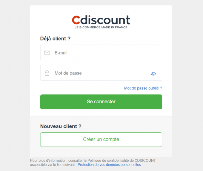
Creation of an account at Cdiscount
For example, to create an account at Cdiscount, all you have to do is enter your email address and a password. Efficient.
The results of our user test concerning Cdiscount showed that the users expected that the creation of the account to be fast and easy.
More precisely, testers appreciated the fact that they did not have to validate their account by email, or still being able to easily modify their personal information.
Regarding the delivery choices
When it comes to the delivery, the users expect to be able to choose among several options. Express home delivery, click and collect, relay point etc. These options have become the delivery standards. To optimize your conversion funnel, you should offer these options but also follow some rules:
- The information about the delivery price should be visible. The price of the delivery remains the main criterion that determines the delivery method chosen by the customers.
- The delivery time is an information that customers expect to have. Although less important than the price to their eyes, this information is still essential.
- Autocompletion and pre-filling of delivery forms are appreciated by consumers.When possible, this allows you to save time and therefore makes the journey more fluid?
Following the user tests carried out on Cdiscount, we noticed that the delivery plan offered was very often highlighted during the buying journey. This greatly annoyed and alerted the testers who have already refused several times the “Cdiscount at will” offer.
Another issue noticed by the users, the paid assistance phone number. This fact discouraged users who wanted to have other contact possibilities (email, chat etc)
Perfectionating the delivery service
Once the order is placed, the hardest part seems to have been done. From then on, you only have to deliver the product on time. However, this step is crucial to optimize the conversion funnel and specifically to assure the client’s loyalty. The successful delivery of the product will strongly influence any future purchases of your customers. It is therefore essential to offer a high quality service.
A responsive delivery follow up
In order to offer a high quality delivery service, it is very important to propose a responsive delivery follow up, letting the client know where his order is exactly? (In course of delivery, being prepared etc) In order to do this, it can be useful to send several emails or text messages to inform the user about the advancement of his delivery. You should take care of communicating every step, a poor follow up will damage the overall experience.
The general lack of follow up is a big problem widely pointed out by the users. Some testers complain specifically about the lack of information once their package has left the retailer’s warehouse.
Take care of the packaging
A successful delivery is synonymous with a product delivered in good condition and that corresponds to the one ordered. In order for the product to be received in the best possible conditions, make sure you use adequate packaging and optimize your product pages (especifically the images and descriptions). A package must have the correct dimensions, and protect what is inside.
In addition, the package can represent an opportunity to promote your brand. Do not hesitate to put your logo on the box.
Upon the reception of the Cdiscount package, some testers received packages with an Amazon logo on the packaging and the order form. This made them skeptical and especially worried when they received their package.
An efficient and responsive after-sales service
Finally, in case of a problem, users expect to have access to a responsive and high quality after sales service. Users expect to be reimbursed if their product is damaged or if the brand's engagements are not respected. The use of vouchers should therefore be avoided because they are seen negatively by customers.
In case of problems during a purchase, a high quality after sales service makes it possible to end on good terms and to not lose a customer definitely.
Cdiscount after sales service was appreciated by the users that requested their help. Customers seem to be systematically reimbursed by bank transfer in the event of a dispute. Even if it is costly, this policy promotes the customer’s loyalty.
There you have it, you now have all the keys to optimize your conversation funnel. For more advice do not hesitate to take a look at the top 10 UX mistakes or to inform yourself about the organization of user tests.
 Published by :